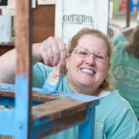
October is going to be a crazy busy month for me! We have some extensive plans for our weekends this month, starting last weekend with a getaway to Colorado.
My husband and I left the kids at home and went for the weekend to celebrate the wedding of one of my close friends from graduate school.
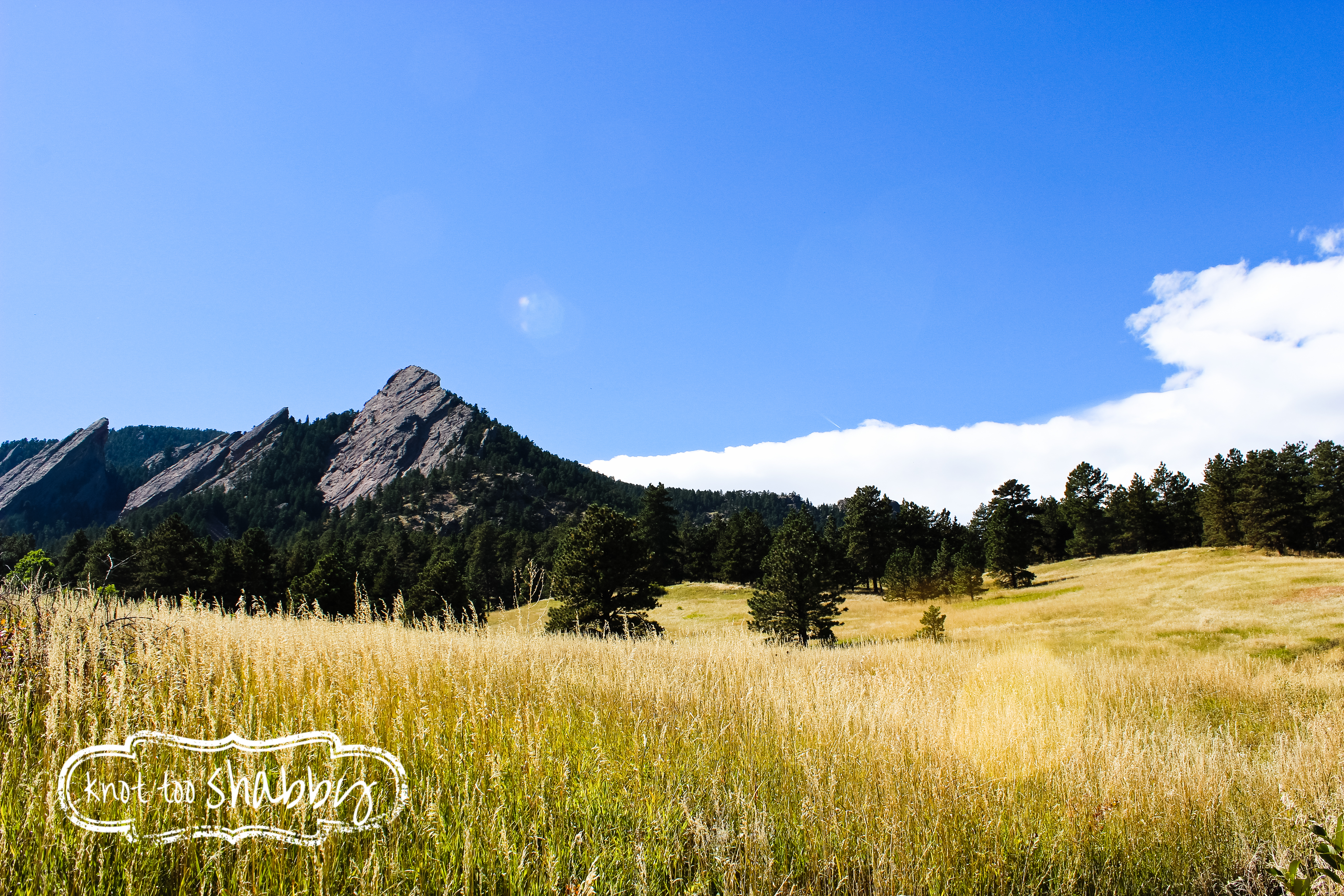
Like all of my out of town trips, I find ways to incorporate activities and ventures that will benefit the shop. In this case, I really wanted to build my photography portfolio with some beautiful scenic pictures that I can use on furniture pieces and in artwork.
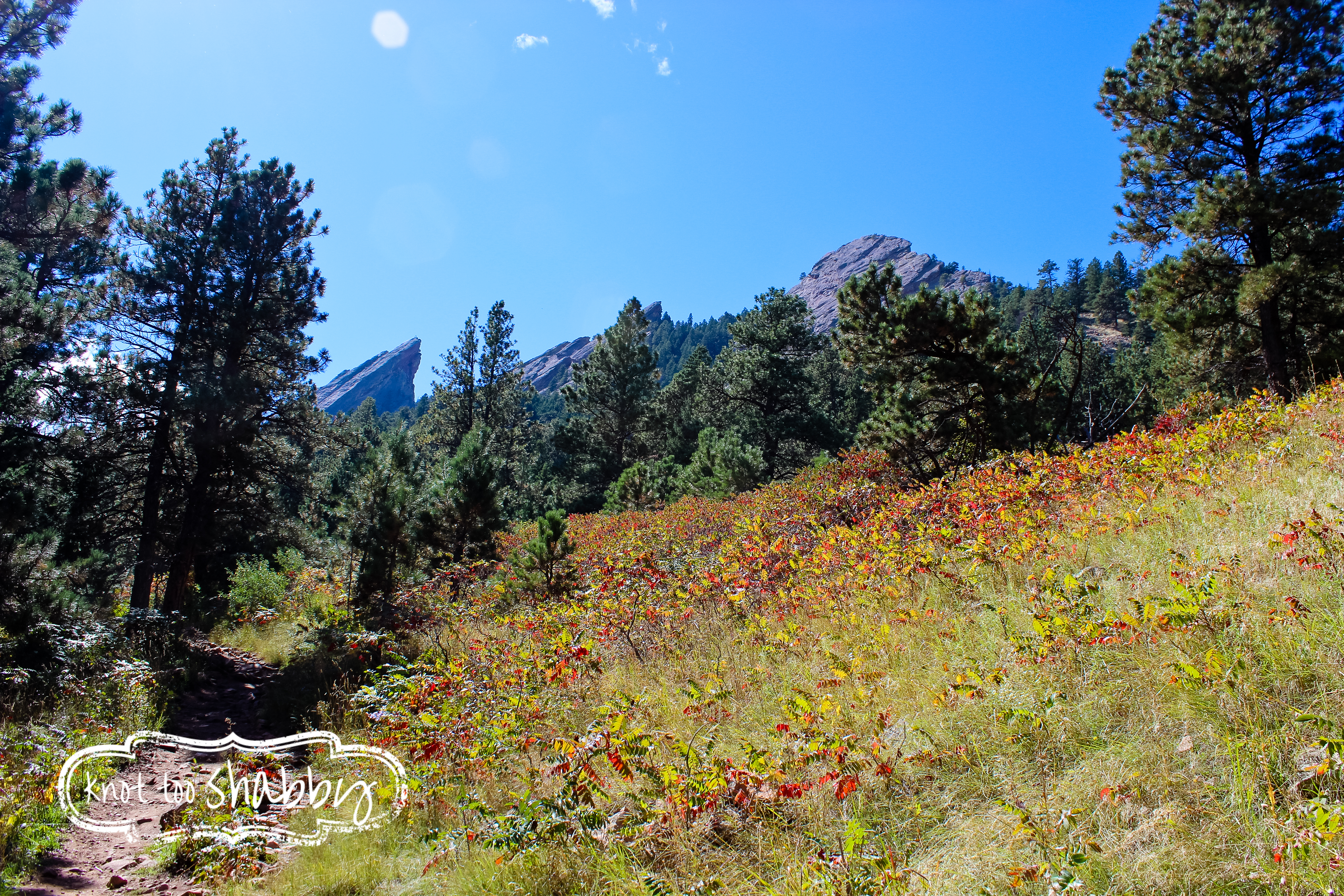
Colorado is just bursting with scenery, I came back home with dozens of different shots from the Flat Irons in Boulder City.
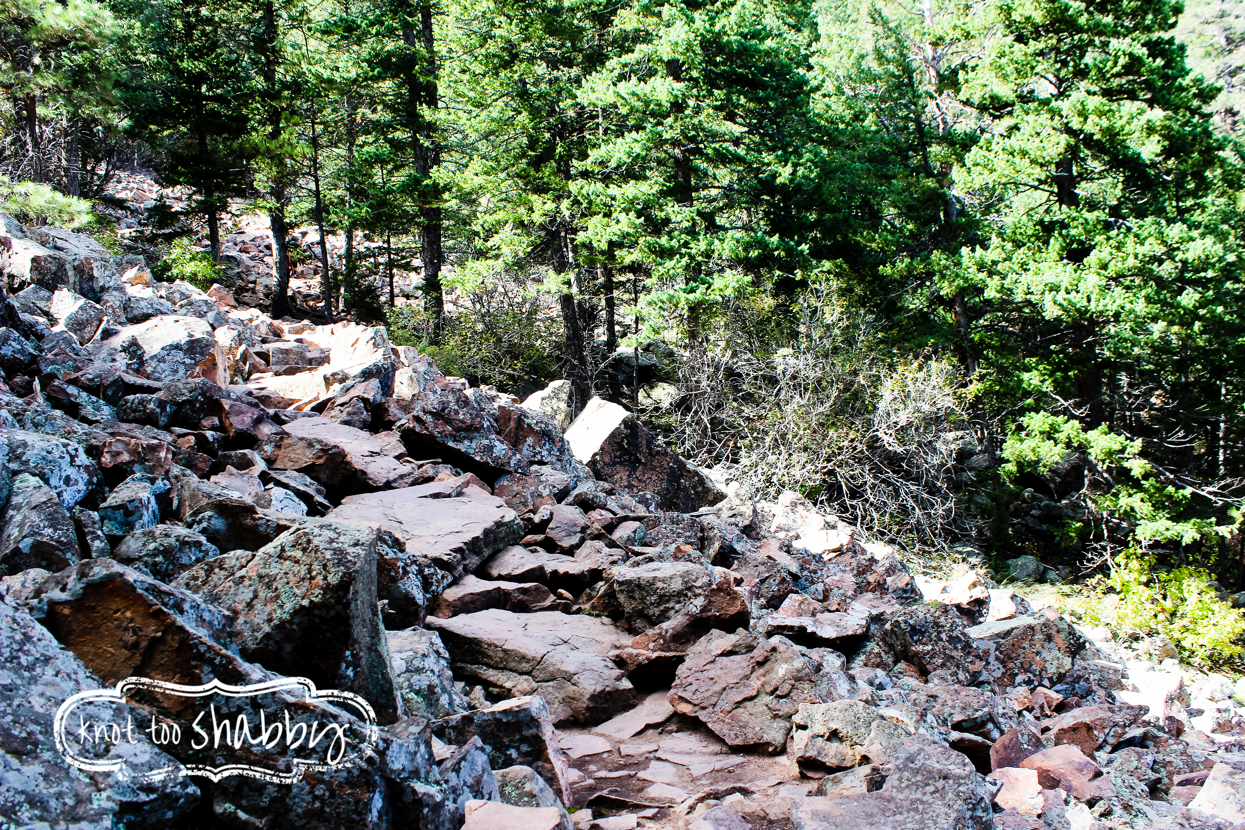
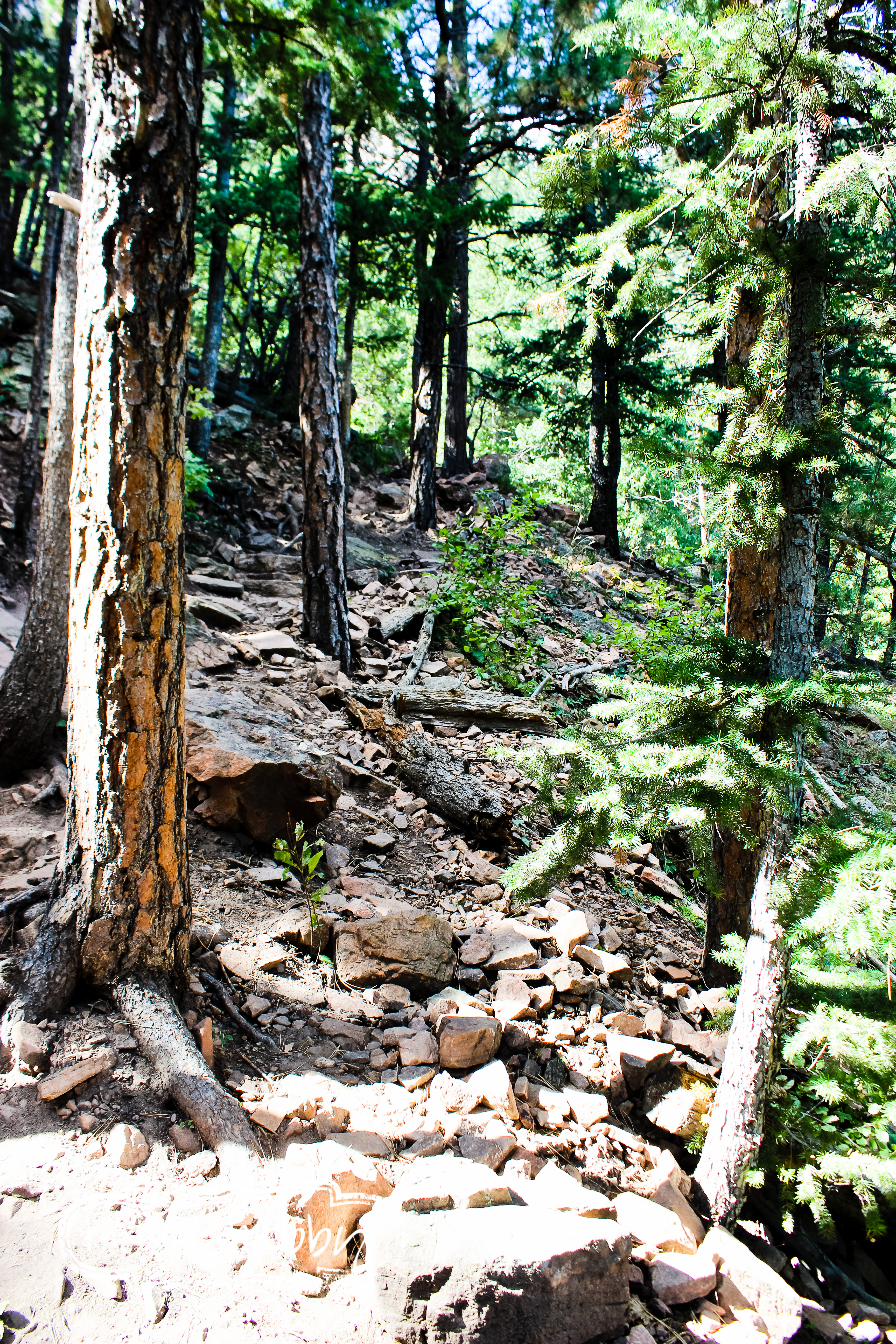
It felt more like rock climbing than hiking which made it that much more fun! As we stumbled over jutting rocks on the trail, I couldn’t help but be mindful of the covered wagons and pioneers that traveled through the Rocky Mountains, only to reach a massive desert before arriving to California! How daunting and frightening that must have been!
Each turn of the “trail” had a breathtaking view of the mountainside.
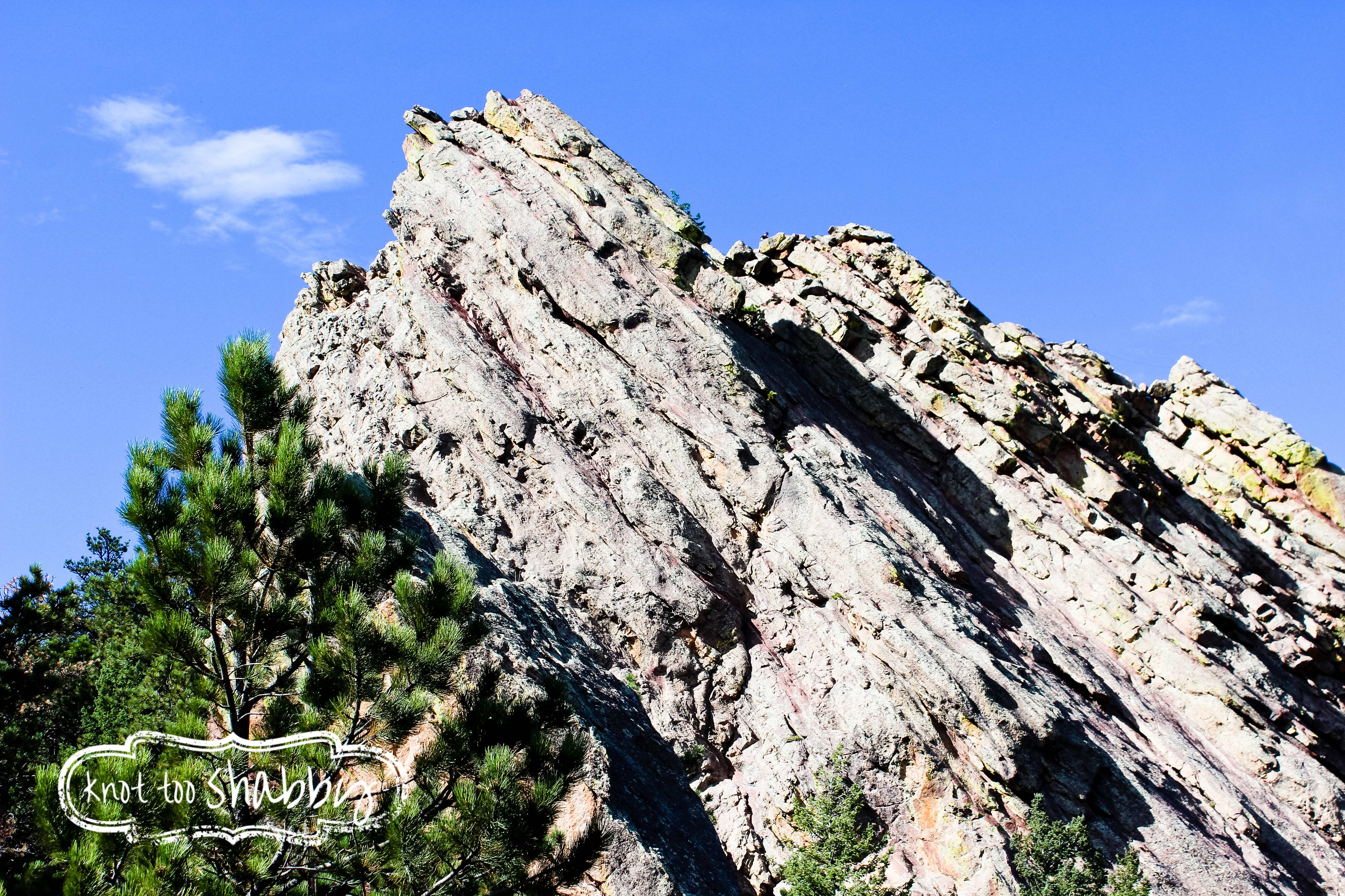
The end of the trail looked out to one of the flat irons where you could see teeny tiny people on the very top!
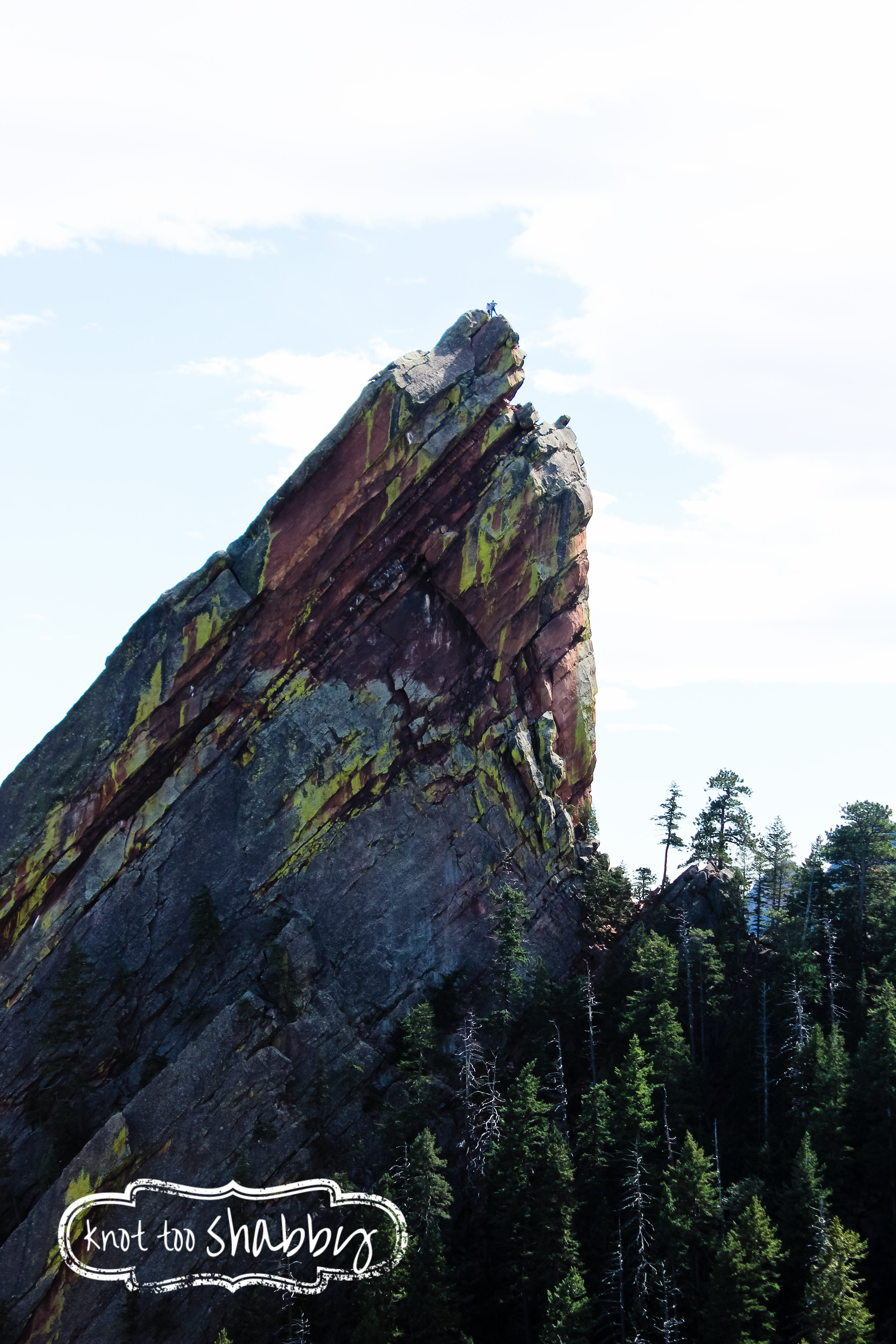
Someday I want to do that kind of rock climbing!
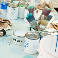
Since I spent most of last week preparing to be gone for four days, I didn’t have time to pop open my recent shipment of paint which had Burgundy, the newest shade of Chalk Paint®.
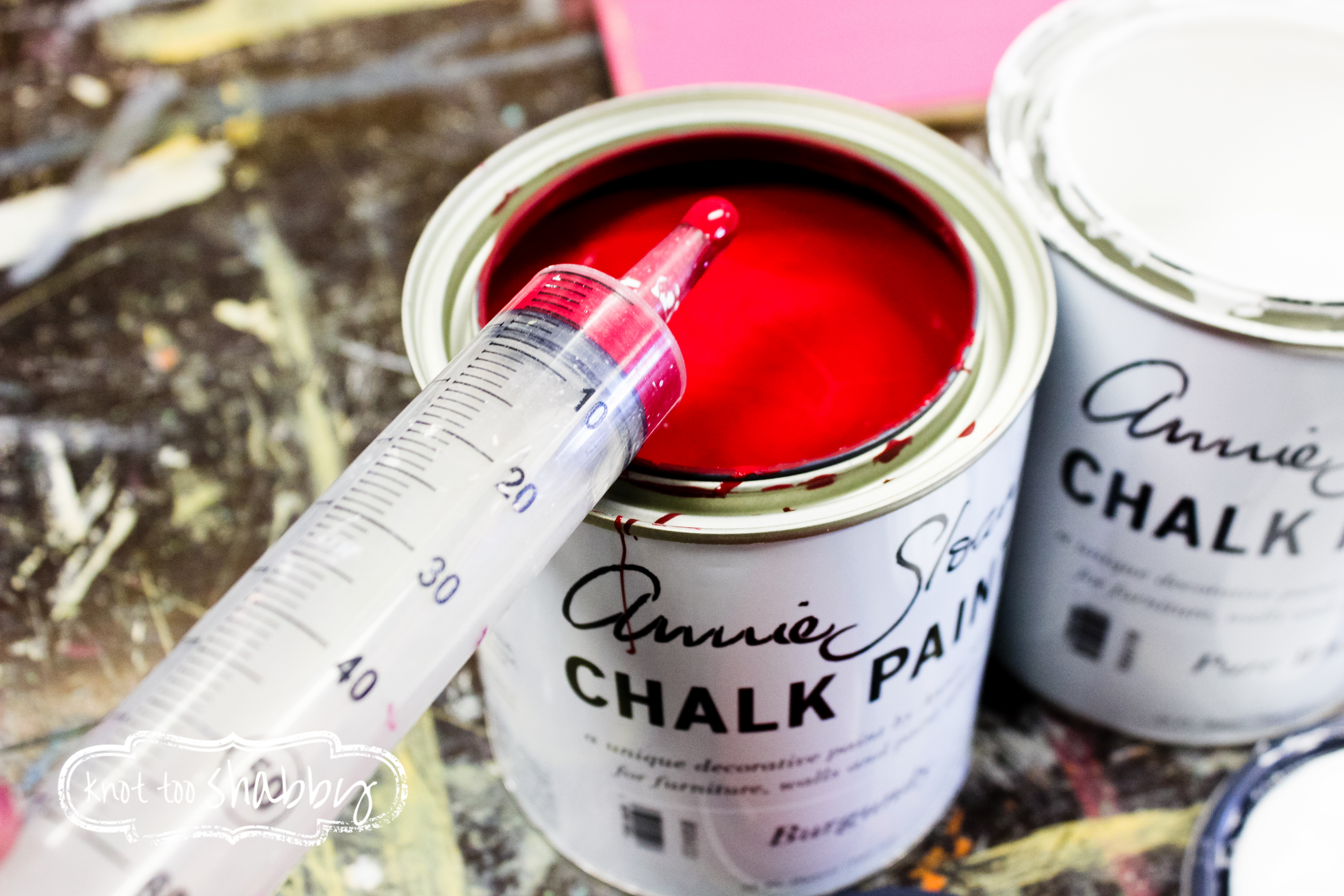
This color has been a long time in coming and I’m so excited to have something new to play with. Today, I finally busted out a can to start playing with color mixtures. My objective: to find a bright shade of fuschia to work into a style shoot in which I’m participating.
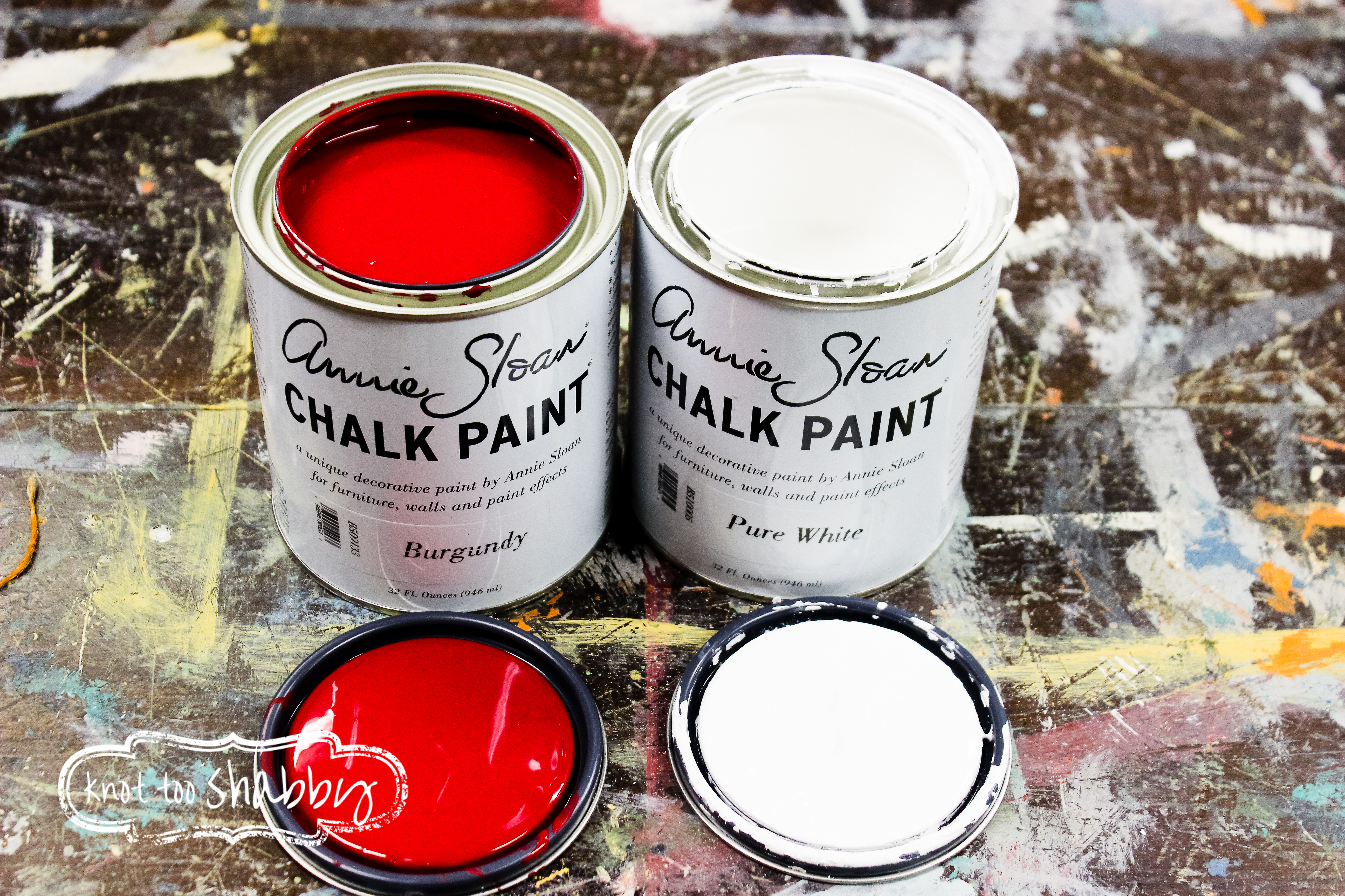
Burgundy is a deep shade of red with a lot of pink undertones. When I mix colors, I like to always start with a one to one ratio. In this case, Burgundy with Pure White.
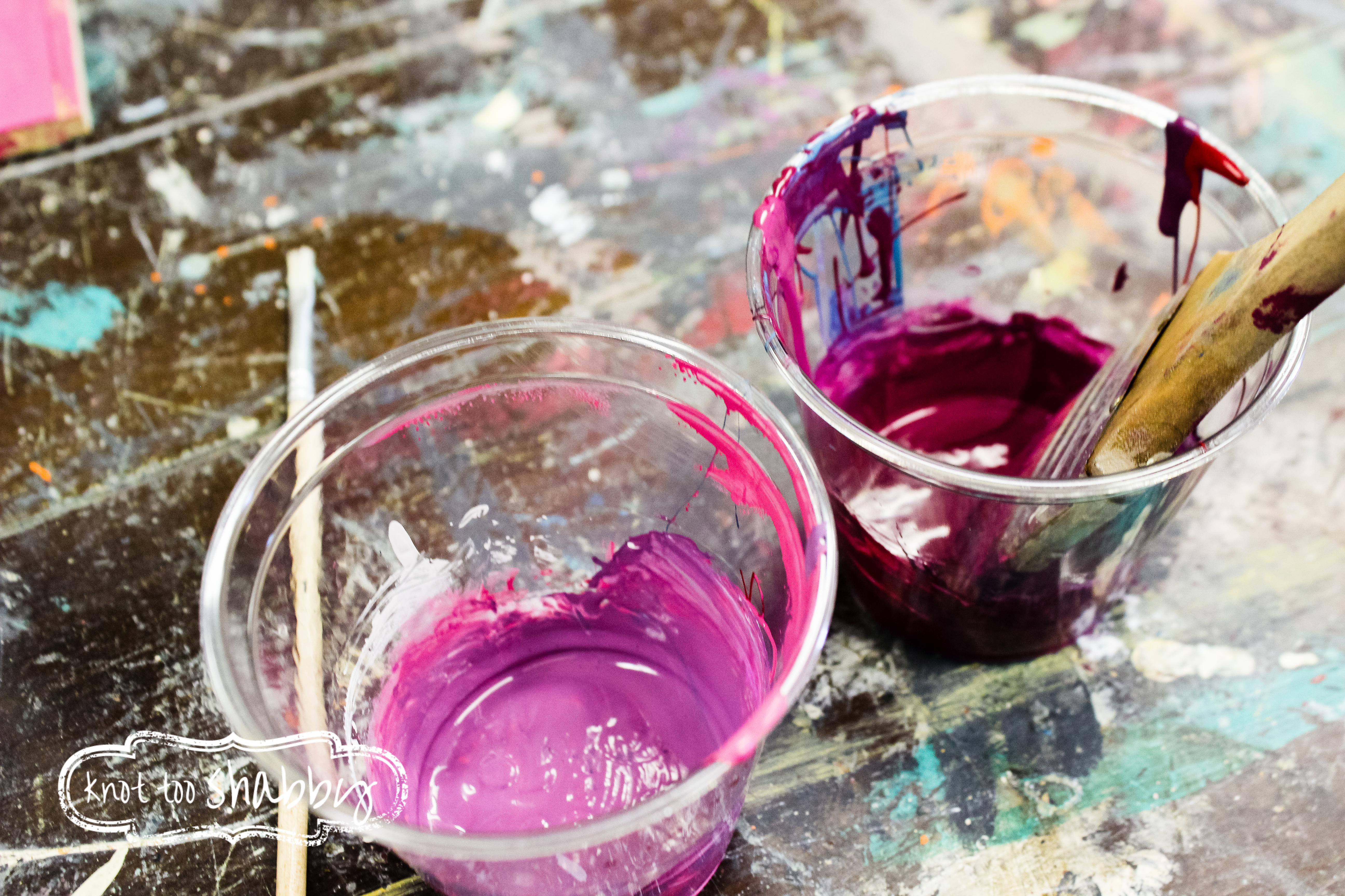
The colors were coming across too pink, so I pulled in a can of Aubusson to bring out more purples.
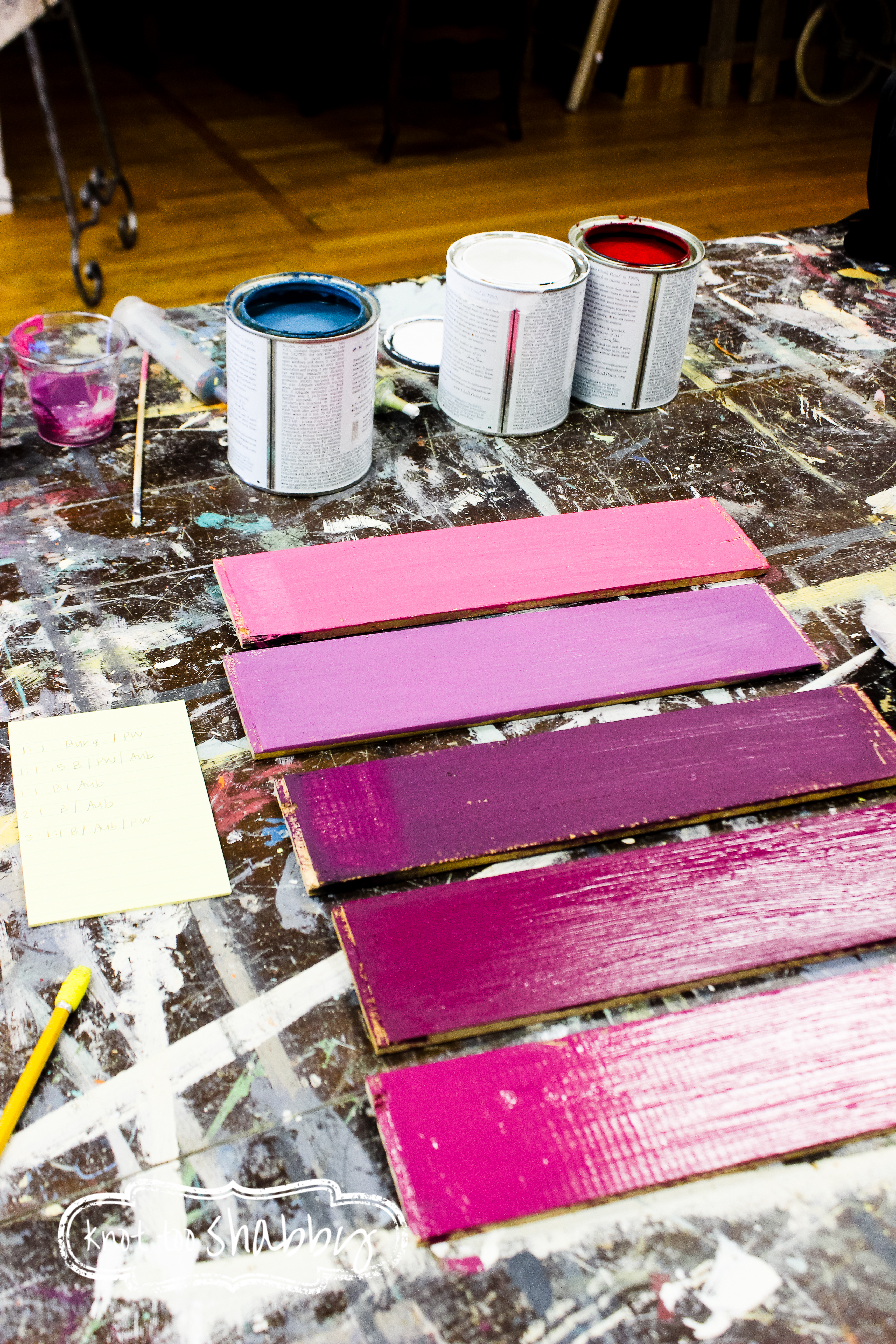
The final color that I will use for the photo shoot is a ratio three parts Burgundy to one part Pure White to one part Aubusson, the sample pictured on the bottom.
I’m just loving the varying shades, though I don’t foresee myself using this color too much in the future. Afterall, it isn’t blue, but it is certainly nice to mix it up a bit!
What other Chalk Paint® colors would you mix with Burgundy?