Nine months ago, I tackled a complete room transformation for my little friend Mila. It took me around four weekends to tackle the project from start to finish. If you are new readers or it’s been so long since you read about the room plan for Mila’s space, you can refresh your memory with the complete design plan here.
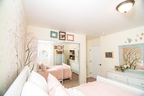
In a nutshell, Mila found inspiration for her room in cherry blossom portraits (basically, Purvi, her mom brainwashed her into wanting a cherry blossom mural on her wall with great success. Go mom)! The color scheme is predominately pale pink with soft blue, white and gold accents. The ultimate goal was to create a beautiful space that had loads of functionality but also something Mila could grow into as she gets older. With that in mind, I opted to keep the main pieces of furniture neutral colors so that when Mila tires of the more childish pink shades, she has quite a bit of versatility in selecting a new color scheme or textiles.
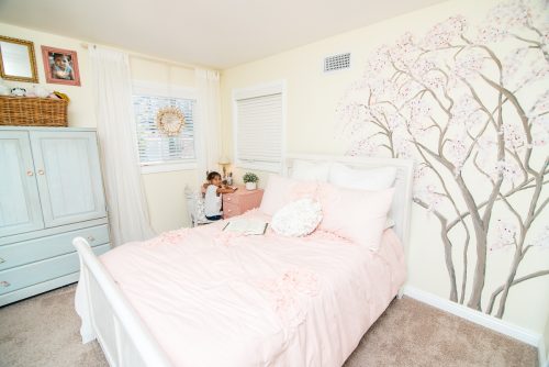
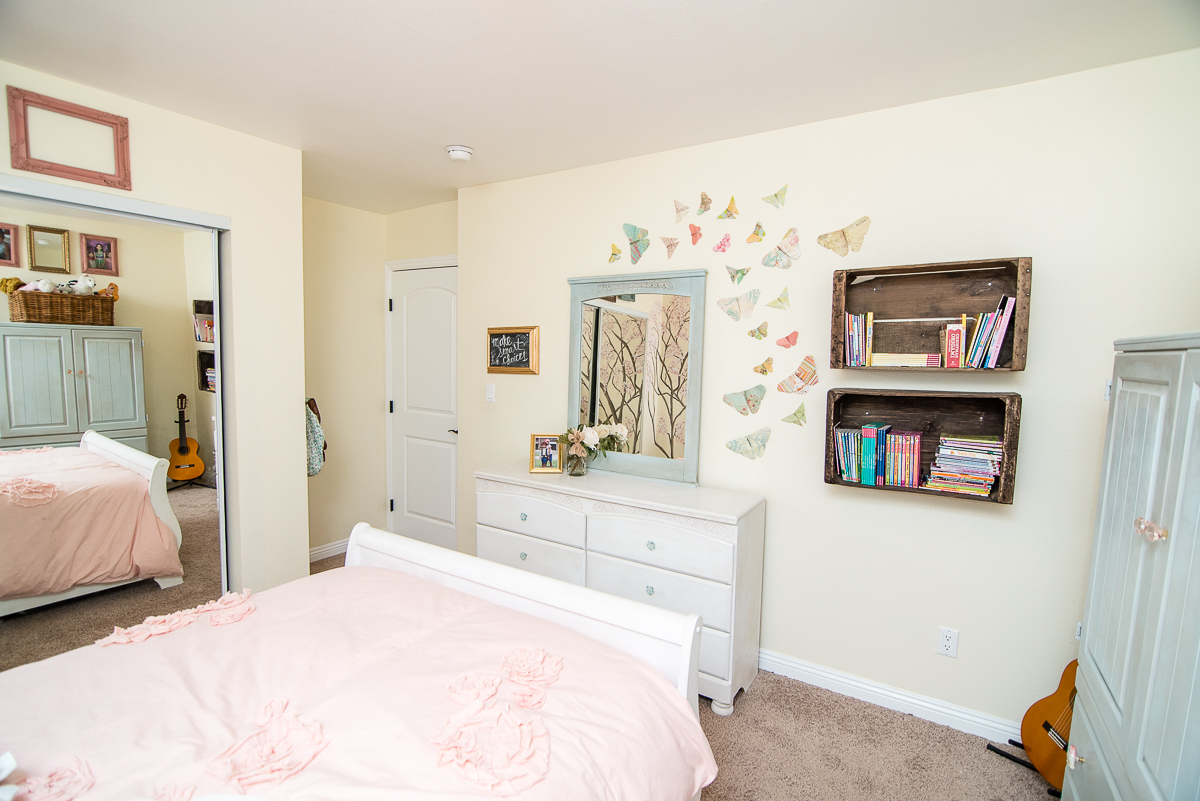
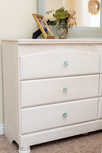
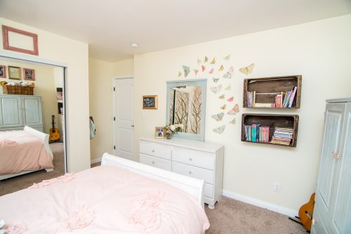
Both her bed and low boy dresser received fresh coats of Pure White Chalk Paint® with a very soft highlighting of dark wax around the edges. So as not to have so much white in the room, the armoire received a custom color mix of Duck Egg Blue and Louis Blue, a color inspired by the springtime sky you would see back dropped against new cherry blossom buds.
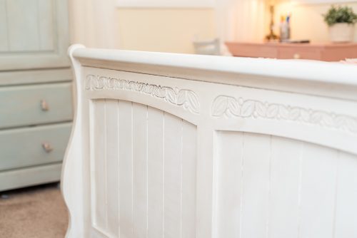
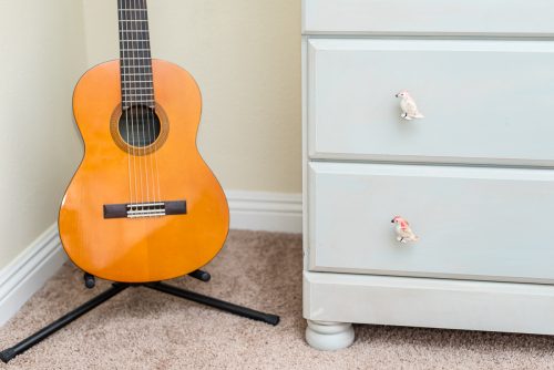
The knobs on both dressers were replaced with new ones. Some mis-matched for a bit of whimsy but in keeping with the light, airy finish of the furniture.
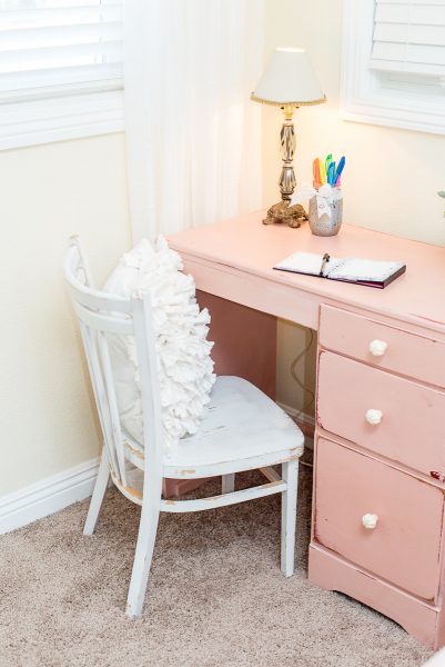
Mila’s small desk is an awesome $10 garage sale find that had a thick and goopy coat of bright red latex paint on it. We ditched the chunky knobs and added another custom color mix of Antoinette, Scandinavian Pink and Pure White to pull the soft blush pink color that is found in her cozy duvet. The edges got sanded back lightly and the slight hint of red in the base coat of the desk compliments the deeper reds and burgundy found on the hand-painted mural on the wall. I picked pink for the desk because this is almost certainly a piece of furniture that Mila will grow out of and replace with something larger or even a nightstand.
One of my design philosophies is that every space should have an element of natural wood to add depth and warmth. Overall, Mila’s design plan lacked the warmth and richness of natural wood. I added authentically rustic wood crates (picked from a farm in No. Cali) on the wall as functional shelving that provided the wood tones but also were a good size and depth so not to crowd the space. Mila’s primary shelving sits tucked away in her closet, but the crates are perfect for her most recent book choices, trophies or other novelties that she loves to keep her eyes on.
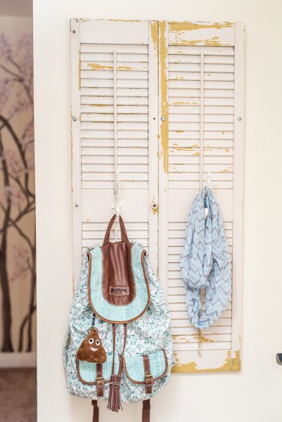
For added storage, we put up two chippy, old window shutters and added hooks to hang a backpack, jacket and scarves. The rustic element of the shutters pulled together the rough textures on the wood crates as well as the chippy paint finish on her white desk chair.
And, the finishing touches are found in a variety of thrift store picture frames, lamps, mirrors and my favorite part…springtime butterflies.
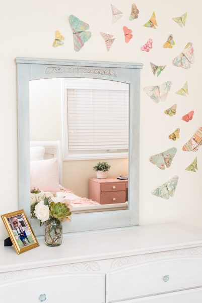
The paper butterflies scattered across the opposite wall of Mila’s bed pull together all of the color choices so that the space is balanced and cohesive!
When we started the makeover, Purvi gave me a $625 budget. Seeing as how we didn’t need to replace any of the furniture, I felt fairly certain that we could work around that figure. There were two major splurges for the room; the first was hiring an artist to hand-paint the cherry blossom mural that served as the main focal point and inspiration of the entire design plan and the second was the duvet and sham set.
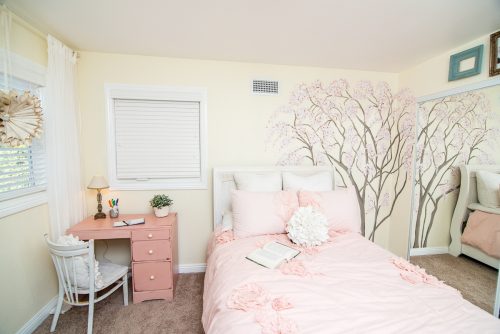
The mural was beautifully created by Kelly Manning of Maeberry Lane Design for $125 (Purvi got a killer deal because I provided all of the paint for the project which included around seven to eight different shades of Chalk Paint®). The duvet and shams are from Land of Nod and set us back a whopping $250. So, over 50% of the entire budget was absorbed in those two items.
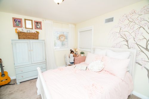
I sacrificed my pick for $80 ruffled curtains for a less expensive option from Ikea, which honestly are just as cute for a fraction of the cost…under $20.
The crates, shutters, desk chair, lamp and frames were all second hand finds that collectively cost under $100.
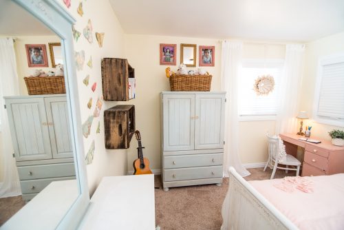
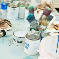
Annie Sloan Paint and wax to refinish all of the furniture was about $175. And, Purvi had to go over budget to replace the hardware of all the furniture pieces which cost $72.
I’m so pleased with how everything came together in this room, and it truly was a team effort. Mila’s dad made sure that the wall hangings were securely fastened into studs so that the shelves and hooks could be as functional and secure as necessary. Purvi and even Mila helped with all of the painting during the entire project! And, all of our kids successfully screwed in all of the knew knobs! So, nine months after completion, I’m FINALLY able to show pictures of the finished project! And, I’ll be posting a video montage of the design job on our YouTube station which shows interviews with Mila, before and after sequence and some tutorial based commentary.
Other credits include Glendora Florist for letting me borrow the great floral display that we used for the design shoot and Caitlin of Killer Cupcake Event Photography for taking the great photos!
