Every year, Pantone® comes out with a fashion color report. This report is a HUGE indication of what the color palette will look like not only in the fashion industry, but for home decor as well. While I’m usually playing catch up on what’s trending, this year with the help of my trusty team and some gentle nudging in the right direction, we’re going to jump on the color bandwagon and start implementing some of the 2016 design trends.
I’m reading that in 2016, bold colors will be all the rage. While I highly doubt greys, black and white will ever lose their trendiness, designers are suggesting that incorporated with the more neutral color palette will be a fresh splash of lively greens, bright yellows and flashy blues…as the Pantone® colors suggest.
The year(s) of the chalkboard walls, burlap fringe and mason jars have exhausted the marketplace and decorators are leaning toward more sophisticated decor. Think clean lines, smooth finishes and dare I say it….METALLICS!
It all sounds a bit “rich” for my blood and a move away from the DIY crowd. Afterall, the average do-it-yourselfer doesn’t typically work with metallic finishes (believe me…I know…I talk to the average DIY-er everyday and metallic finishes and bright colors scare the poop out of them)!
Which begs the question, how do we bring these new design trends into our world of do-it-yourself painting and decorating?
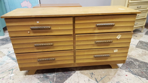
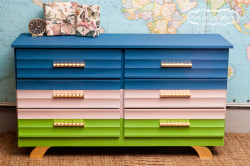
How ’bout we start with a Mid-Century Modern before and after that incorporates these 2016 design elements.
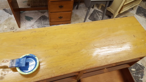
This particular dresser has been tucked away in the back of my storage unit for over a year! It’s one of the forgotten farmhouse relics from our salvage project in December of ’14! Mid-century is NOT MY STYLE! I love it…in someone else’s house. So, it sat because I don’t like working on pieces that I don’t like.
However, for our 2016 trends; i.e. clean lines and sophisticated furniture, this one fit the bill. A bonus was that it is in structurally great condition, free from too much cosmetic damage.
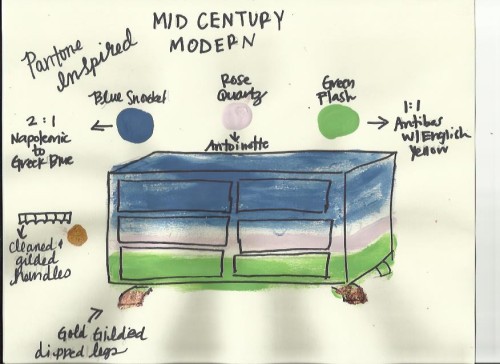
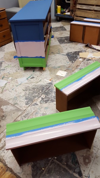
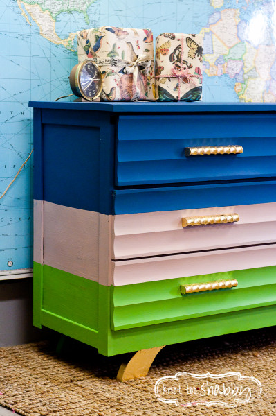
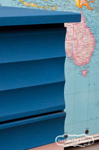
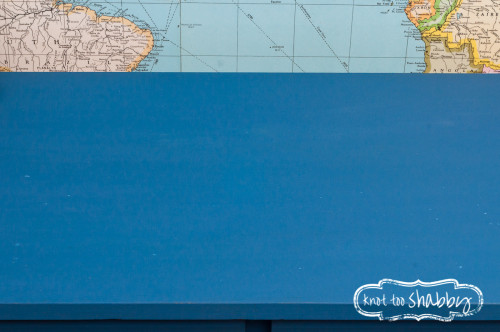
My design plan was to go bold, metallic and clean! I drew from the Pantone® colors and selected three as my inspiration: Blue Snorckel, Green Flash and Rose Quartz which is one of the two colors of the year. It just so happens that Annie’s Chalk Paint® color palette makes mixing these selections a breeze!
Blue Snorckel = two parts Napoleonic Blue to one part Greek Blue
Green Flash = equal parts Antibes and English Yellow
Rose Quartz is a dead ringer for straight up Antoinette.
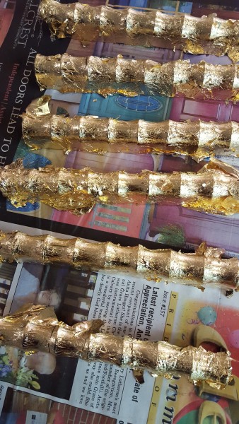
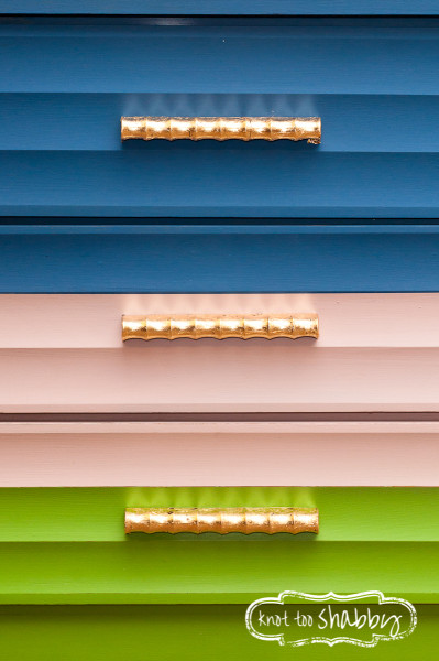
The classic mid-century handles needed to be spruced up! Enter the metallic finishes. To compliment the gold dipped legs, gold gilding was planned for all of the handles. Guess what!? Gilding is easy to do with just a bit of direction. You’ll want a packet of Gold Gilding sheets and a small container of Gold Size which is the glue medium that attaches the gilding. I’ve had success gilding wood, metal and even plastic!
After gilding the handles, this dresser will be forever referred to as “The Rolos Dresser.” Get it? Because the handles look like a package of Rolos!
Here’s how the plan came together!
And now for the plug…
OF COURSE we offer an Advanced Decorative Finishes Workshop so that you, too can learn how to conceptualize and implement this type of decorative finish. Gilding, that is. The gilding component of our Advanced Decorative Finishes Workshop is just one of over a dozen different techniques taught during that class.
And, coming up this Spring, we will be launching a color mixing workshop that will work with the recipes specifically inspired by the 2016 Pantone® color choices as well as working with a project. So, stay tuned to our facebook and/or instagram pages if that might be something you’d be interested in taking!


