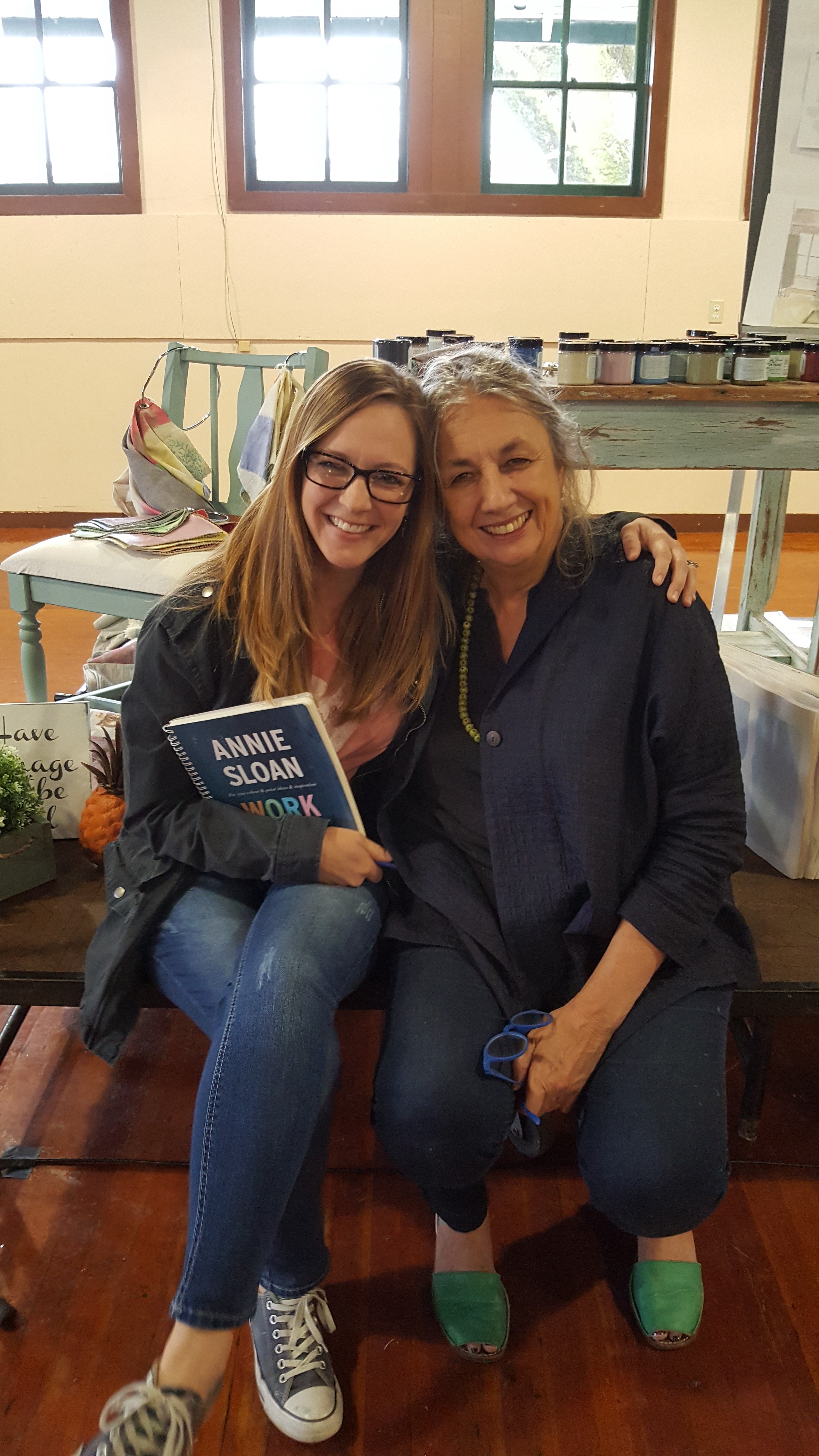
Last month, I went on a whirlwind of a trip to Oregon to take a painting class with Annie Sloan.
By whirlwind, I had to align the sun, moon and stars to pull together childcare, store coverage and the dollars to get myself to Oregon all within an eight to ten day time frame. But, IT WAS COMPLETELY WORTH IT!
I stayed in Oregon City right on one of the many rivers and commuted the short fifteen minutes into Canby where Annie Was teaching her class.

This workshop was like taking Annie’s Color Recipes for Painted Furniture and bringing it to life! Of her books, that one is my favorite and I’ve read it multiple times, sometimes in sections and cover to cover. But, nothing compared to having her teach the content of that book!
It’s entirely impossible to convey in writing the experience I had learning from THE BEST in the industry! But, I’ll try.
This is what I love about Annie Sloan Paint, her products, the person…everything, and I mean EVERYTHING is done with complete intentionality. The colors she has created are made with versatility for mixing and blending and an authenticity for the inspiration in which the color has been named.

The workshop began with tips on curating the design and style of our shops (there were around sixty shop owners taking this workshop with me) and understanding the various definitions of “vintage style.” Oddly enough, I had an e-mail exchange with Annie about five years where she helped me to understand and be able to communicate what my design style is. You can read about that exchange here.
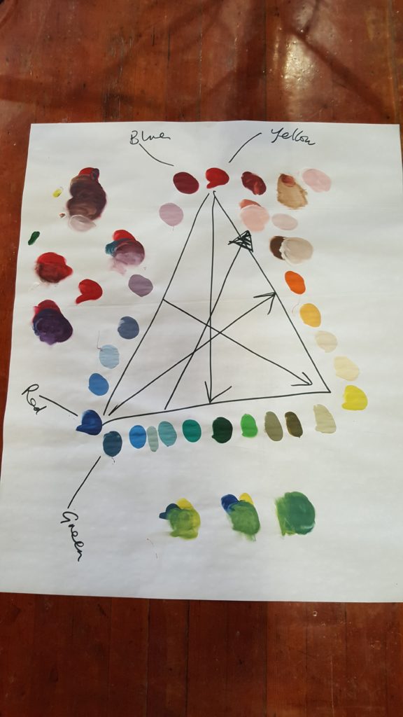
She then, seamlessly transitioned into teaching us how to use color, both within the context of our stores, but also in our homes. For some, pairing colors and/or mixing them together is intuitive. You can see a lime green and just know that English Yellow and Antibes will give you that perfect shade of lime green. Because I’ve been mixing colors for so long, and because I’ve read much on the subject, I’ve become quite good at it. But, that isn’t the case for most people. I learned the “non-intuitive” way of understanding color which will be an amazing tool to have in my pocket both when I teach about color but also when I work with our customers on custom color mixing or pairings.

I couldn’t possibly even begin to summarize everything that I learned, but I’ll pass on a couple of fun nuggets of information from Annie Sloan herself.
- When you are working with a lot of color in a space, you should use a lot of white or black to provide balance.
- Take time to curate your home. What you may see as an eclectic gathering of objects in reality is a mis-matched mess that doesn’t work well together.
- When you are working with the neutral shades (Paloma, Paris Grey, Country Grey, etc.), you should understand what colors are used to create those neutrals so that you can pair the same colors in your space. For example, Paris Grey is made by mixing Barcelona Orange, Napoleonic Blue and white together. Therefore, pairing orange and blue into a space dominated by Paris Grey works well together.
If I could pass along one tip, it would be that understanding the neutral colors will completely change how you infuse color into your design!
And People…I’m always here to help inspire confidence in your projects and share tips and tricks. So just come in and ask!!! (Or take a workshop ;))


