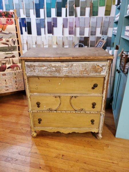
It’s hard to imagine how truly terrible looking furniture can become something worthy of having in your home. Even I get stumped from time to time on certain pieces, and this dresser, which was given to me, was one of those pieces that looked like it was hardly worth the effort. The inside of the drawers were filthy. The finish was so chipped and flaky and the wood detail on the front drawer looked unfinished (though, it wasn’t).
But, what’s nice about free furniture, whether pulled from the trash or gifted by a friend, is that it provides opportunity to experiment and stretch your artistic skills. Afterall, when you don’t have any money in a piece, what do you have to lose?
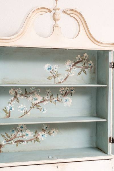
That unfinished, wood carving on the third drawer is what gave me inspiration. In it, I saw a lion snout. Now, I have never in my life drawn a free-form lion. The most free-hand I’ve ever gotten is doing cherry blossom style blooms on the inside of a secretary hutch (on the inside where decorations could cover it up if it looked dumb). I figured the worst case scenario was that it looked stupid and I could just paint over it. So, I decided to stretch my ability, work with a variety of colors and give it a shot.
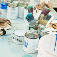
I painted the entire body and framework in Annie Sloan Paloma. Then, I started to frame out the lion.
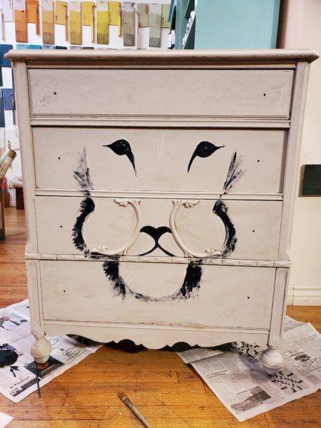
So, it looked ridiculous from the get go with the gigantic chipmunk cheeks. No worries…I just filled in the face with some color to try to define it a bit better.
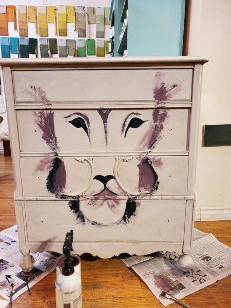
I knew if I couldn’t get the eyes and snout right, this was a lost cause. I added some color to the face and snout.
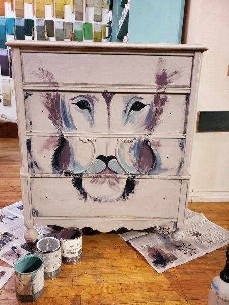
Then, I wasn’t sure what to do, so I just filled in the entire face.
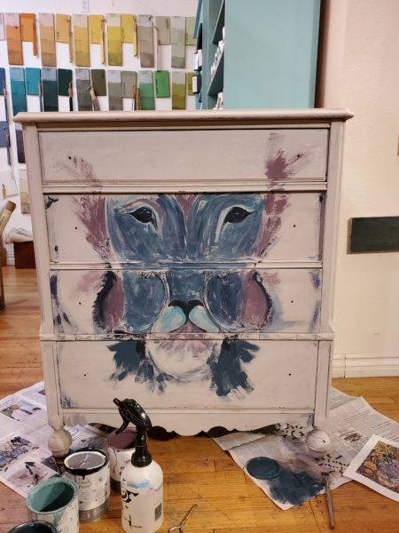
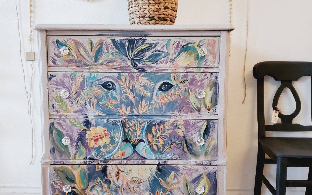
The original picture that I drew my inspiration from had a lion head peeking through flowers. So, I added layers of flowers around the framework and over the face.
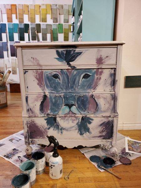
And, a lot of leaves…
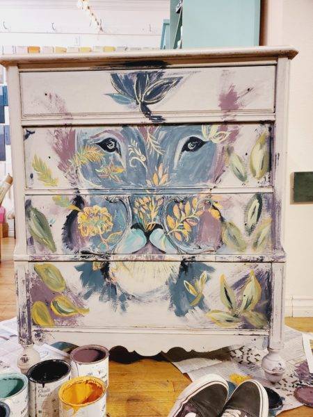
…with a lot of colors. What I learned while I was working on this was the importance of adding detailed outlines of the leaf and petal shapes. So, when I finished with the bulk of the flowers, I took my small Annie Sloan detail brush and just added outlines in different colors. If I didn’t like a section or wanted to cover up an awkward part of the lion, I just added more color and more flowers. So the end result was this:
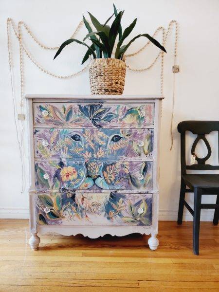
Can you tell how I covered up the chubby cheeks?
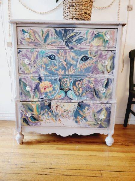
I tried to balance the color so that the darks, brights and lights weren’t laid out in an uneven fashion.
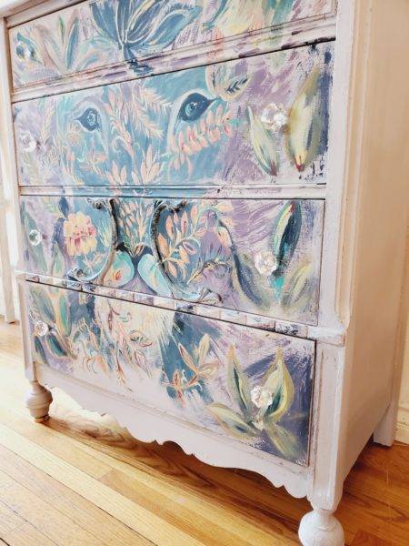
I’m pretty darn happy with how this came out! It’s given me permission to try my hand with a more detailed and creative approach to my furniture. I encourage YOU to do the same! 🙂

